Need help with image caption

I have some Kramdown image code that works well:

![github pages themes.png](/assets/img/github pages themes.png){: style="float: right; 
height: 65%; width: 65%; margin-left: 1em; margin-top: 2em;"}{:class="img-responsive"}

For a couple of days now I’ve been trying to figure out how to expand it with an italicized image caption centered under the image (which would include a hyper-link to credit image creator). I found this SO code which I “think” I need to insert:

<figure>
  <img
  src="https://developer.mozilla.org/static/img/favicon144.png"
  alt="The beautiful MDN logo.">
  <figcaption>MDN Logo</figcaption>
</figure>

BTW: I believe class="img-responsive" is a bootstrap command issued by Cayman Theme.

For my existing code I’d like to make float default to none when not passed as a parameter. Also width and height should default to 100% if not passed. Similarly margin should be 0px if not passed as a parameter. I’d like the caption to use a smaller font and as a hack I’m currently using <sup>caption text</sup>:


My website does have an /assets/css/style.scss with a few functions for buttons and whatnot so I’m not adverse to adding Sass code. I just don’t know what code to add where so… any help would be appreciated!

IMG RESPONSIVE

I don’t understand what you mean here and I can’t find any use of that class on the theme’s code or site. Also on your site, that class is not doing anything that I can see on your img when I inspect it.

So I’d say track down what that class does and if you even need it. And if you need it on your site you can add it to your styles.css file.

DEFAULTS

Regarding defaults, you should use CSS’s specificity rules.

So set up for example:

.img-responsive {
  float: none;
  width: 100%;
  height: 100%;
  margin: 0px;
}

Then to override those defaults, just set a value using the style.

In plain CSS, setting style like this will override the class rules.

<!-- Default settings -->
<img class="img-responsive"/>

<!-- Defaults with overrides on two fields -->
<img class="img-responsive" style="{float: left; margin: 10px}" />

MD vs HTML

This snippet you gave is specifically for Markdown.

Given you want to use figure and figcaption, you’ll want to move that to be in all HTML.

And therefore you can ditch the kramdown and go with this:

<figure>
  <img
    src="https://developer.mozilla.org/static/img/favicon144.png"
     alt="The beautiful MDN logo."
     class="img-responsive"
     style="float: right; 
height: 65%; width: 65%; margin-left: 1em; margin-top: 2em;"
    >
  <figcaption>MDN Logo</figcaption>
</figure>

Parameters

If you want to keep that lighter, you can make an includes file.

_includes/image.html

<figure>
  <img
    src="{{ include.src }}"
     alt="{{ include.alt }}"
     class="img-responsive"
     style="{{ include.style }}"
    >
  <figcaption>{{ include.caption }}</figcaption>
</figure>

Then all you need to do use is one line:

{% include image.html src="abc.png" alt="Logo" caption="My caption here" %}

And if you want to set style overrides:

{% include image.html src="abc.png" alt="Logo"
   caption="My caption here"
   style="float: right; height: 65%; width: 65%"
%}

I use a caption in an includes file here

Caption

sub is fine to use.

If it is too small, you can always set a rule

sub {
  font-size: 10px;
  // OR
  font-size: small;
}

You could also set that rule on figcaption instead without using sub, so you can make the text inside figcaption small.

1 Like

You can also pass variables

{% assign img_src="abc.png" %}
{% assign caption="My caption here" %}

{% include image.html src=img_src alt="Logo" caption=caption %}
1 Like

This class may have come from the Merlot theme which I used between October 20 and 27 before switching back to Cayman theme. I’ll remove it from the page and see what if anything happens.

Thank you for the great lengths explaining MD vs HTML and the CSS examples. I’ll hop over to the website and try these out now.

1 Like

Almost there:


Need to center caption under image

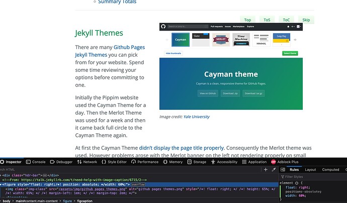
The caption github pages themes.png doesn’t appear centered under the image but rather to the left above the image.

I’ve been experimenting on your page by editing the DOM and by changing CSS - using dev tools.

I took everything off the page except the figure and got this


I turned float: right off of the image and then they were together.


Then I did float: right on the figure rather then the img and figcaption. This seemed like a good idea.


I tried it on the full page and then it broke :frowning:

Oh I got it!

I turned off all the custom styling on img and figcaption. Not floating and position there.

Then I made sure the figure had a width added to float: right.

I was experimenting with solutions in Stack Overflow Q&A while you were experimenting with DOM and CSS.

I’m afraid I’m NOT using any dev tools so I don’t know how you did what you did. Plus I can’t enlarge the screenshots of your dev-tools to see what’s going on.

Could you please copy and paste the float: right; and width: code you are referring to?

Thanks!

Dev tools are built into the browser.

Right click and Inspect and element on the page.

Or in Firefox: Settings > More Tools > Web Developers tools

Chrome:


Jekyll forums let’s you expand images.

Mouse over.

Click the expand button in the bottom right.

Click on the image to make it big.


The code is like this - either in CSS file or style property on figure element.

figure {
  float: right;
  width: 60%;
}
1 Like

It’s been solved 24 hours later and 150 commits (or so it seems) later:


THANK YOU for all your help!

I’m using Firefox on Ubuntu not Chrome. I’m using Chrome on Android but cell phone screen is too small for anything but simple website updates.

I was zooming in the picture previously but I couldn’t read the text in the image.

I need to redesign because all figures float right at 60% now, including the top of page image designed to be left at 50%. However I’m mentally drained by learning: “Whatever floats your H.M.S.CSS boat” so I won’t enhance that for a week.

Time to go back to my comfort zone for awhile and do some python programming and converting Stack Exchange Answers to Jekyll Blog Posts. :slight_smile:

1 Like

The dev tools are similar across browsers.

On mobile I don’t think there is a dev tools.

Glad you got it solved.

If a rule is too aggressive on all figures then you can be more selective with a class.

E.g.

.right {
  float: right;
  width: ...
}
<figure class="right">...

I “figured” out what was causing the problems for me. The figure section is divided into two subsections: img and figcaption. The style was being applied to the img section only leaving the figcaption appearing way out in left field.

The secret is to style the figure section which will encompass both the img and figcaption subsections at the same time:

<figure
    style="{{ include.style }}"
  >
  <img
    src="{{ include.src }}"
    alt="{{ include.alt }}"
    >
  <figcaption>{{ include.caption }}</figcaption>
</figure>

Then to call it from Markdown I actually created three separate includes for now: image.html, image-left.html and image-right.html.

The top of the page image call looks like this:

{% include image-left.html src="/assets/img/pngwing.com.png"
   alt="Github Octacat Mascot by pngwing.com"
   style="float: left; width: 50%; margin: 2em 1em 0px 0px; text-align: center;"
   caption="Github's Octocat Mascot image credit: 
      <a href='https://www.pngwing.com/en/free-png-medya'>PNGWING</a>"
%}

The middle of the page image call looks like this:

{% include image-right.html src="/assets/img/github pages themes.png"
   alt="github pages themes.png"
   style="float: right; width: 60%; margin: 2em 0px 0px 1em; text-align: center;"
   caption="Image credit:
            <a href='https://docs.ycrc.yale.edu/clusters-at-yale/guides/github_pages/'
               >Yale University</a>"
%}

The universal image border script in CSS looks like this:


figure {
  padding: 10px;
  border-top: 1px solid #999;
  border-right: 2px solid #555;
  border-bottom: 2px solid #555;
  border-left: 1px solid #999;
}
figure figcaption {
  text-align: center;
}

I can still make some improvements by tightening the code, but I’m happy now :slight_smile:

Once again, I want to thank you for introducing me to this area. Next I think I might tackle Image Carousels :wink:

1 Like

Thansk for sharing. That looks like a good fix and a good approach for choosing layout.

You could also make it a single image.html which accepts a value as “left” “right” or “” for center and then produces one of 3 style values.

Or you can keep them as separate files and move any common code to a 4th file which gets called by inside the other 3, again reducing duplication. So if you add a class to img, do you it in one file and not 3.

1 Like

Thank you for the suggestions. I had already known I need to shorten the current approach but had postponed that task for a while. Your suggestions will help when I get back to the task.

1 Like

Removed

I finally got around to implementing your suggestions from a fortnight ago. I’ve commented out the scss previously used for styling:

/* Now in _includes/image.html
figure {
  padding: 10px;
  border-top: 1px solid #999;
  border-right: 2px solid #555;
  border-bottom: 2px solid #555;
  border-left: 1px solid #999;
}
figure figcaption {
  text-align: center;
}
*/

Then I removed image-left.html and image-right.html in _includes/ directory.

Changed

The code removed from assets/css/style.scss now sits in a single file _includes/image.html:

<figure
    style="{{ include.style }}
            padding: 10px;
            border-top: 1px solid #999;
            border-right: 2px solid #555;
            border-bottom: 2px solid #555;
            border-left: 1px solid #999;
          "
  >
  <img
    src="{{ include.src }}"
    alt="{{ include.alt }}"
    class="img-class"
  />
  <figcaption
    style="text-align: center;"
    >
    <sup><em> {{ include.caption }} </em></sup>
  </figcaption>
</figure>

Usage

Now to call the image function and pass image left or image right parameters the following two methods can be used.

Float Right:

{% include image.html src="/assets/img/github pages themes.png"
   alt="github pages themes.png"
   style="float: right; width: 60%; margin: 2em 0px 0px 1em;"
   caption="Image credit:
            <a href='https://docs.ycrc.yale.edu/clusters-at-yale/guides/github_pages/'
               >Yale University</a>"
%}

Float Left:


{% include image.html src="/assets/img/pngwing.com.png"
   alt="GitHub Octacat Mascot by pngwing.com"
   style="float: left; width: 45%; margin: 2em 1em 0px 0px;"
   caption="GitHub's Octocat Mascot image credit: 
      <a href='https://www.pngwing.com/en/free-png-medya'>PNGWING</a>"
%}

Summary

The code is easier to understand and maintain having everything in one file rather than four different files. Additionally the global figure {} and figure figcaption {} functions aren’t applying to everything on the website.

1 Like

Thanks for sharing. That’s a neat way of doing it.

By the way, if you wanted to say center all figure elements on certain pages and not others, you could make a class.

.center {
  text-align: center;
}

Then apply as needed.

Standard

<figure></figure>

Centered

<figure class="center"></figure>
<div class="center"></div>